Design engineering a share and collaborate popover
Building and optimizing UI from the lens of a design engineer
I've designed and built many UIs over the years, so intuition plays a big role in recognizing when an interface can be improved. But while it’s easy to trust intuition, validating it leads to much stronger design decisions.
And validation doesn’t require a formal study. Even lightweight methods like heuristic evaluation and discount usability testing1 surface most of the issues that matter.
Taste plays a real role in design engineering. It's something that develops over years of exposure to interfaces, using them and building them. When something feels off about an interaction, that feeling is compressing experience into a signal before you can put theory behind it. The design vocabulary helps you validate and communicate it, but the noticing comes first.
From idea to paper
Let's look at the example below, a share and collaborate popover. My intuition says the interaction is overly complex and could be simplified.
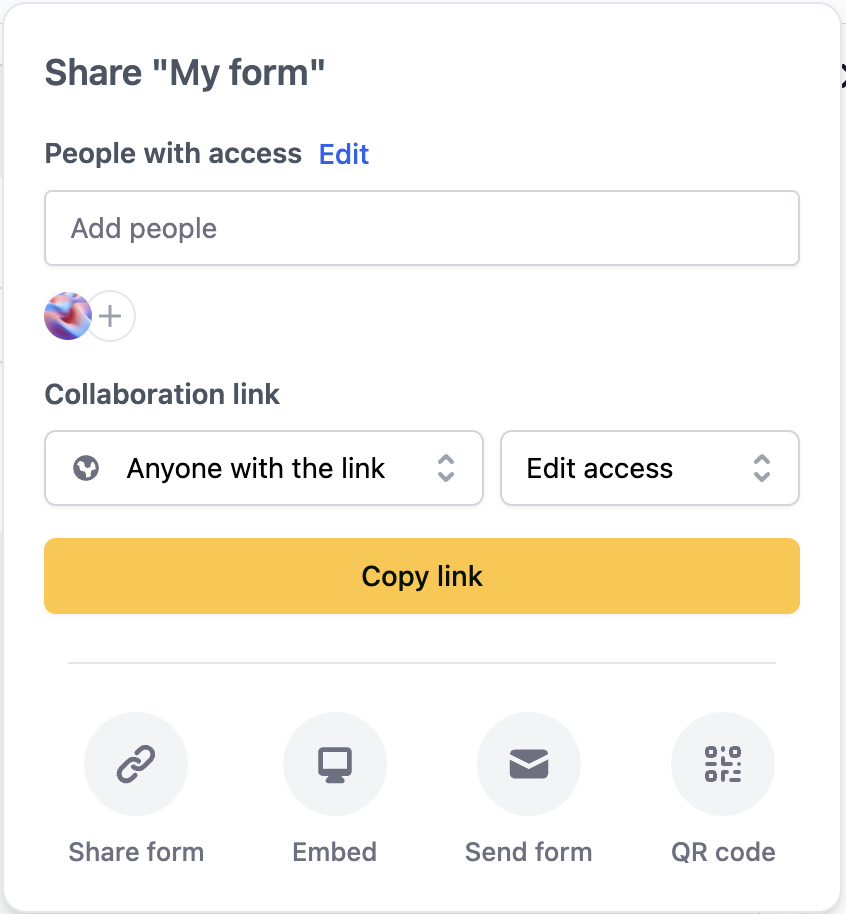
Let's break it down.
The add people flow
The "Add people" input suggests that clicking on it should let us type and search for users to add. Instead, it navigates to a second screen (see image below). This closely resembles a standard input field prevalent across the web, so it should behave like one. This false affordance goes against Jakob's Law2, 3 and introduces unnecessary cognitive load.
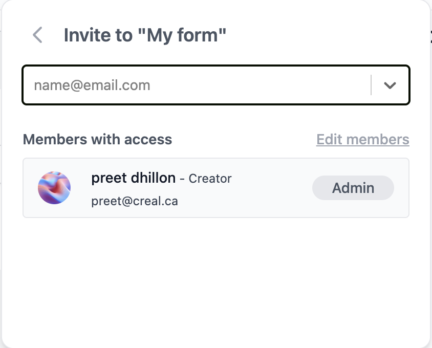
The second screen feels unnecessary, adding an extra step users must process before completing their task. The Edit members button also leads to a settings page where the same actions are available. While redundancy in access can be good UX, in this case the primary flow and second screen can be streamlined into a single combobox component.
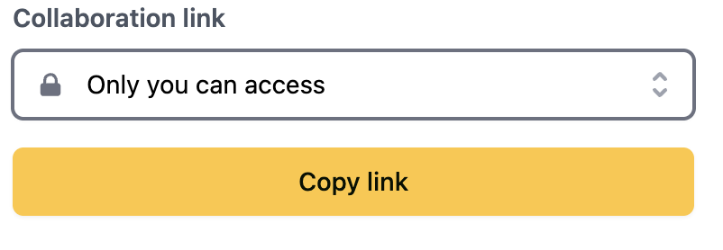
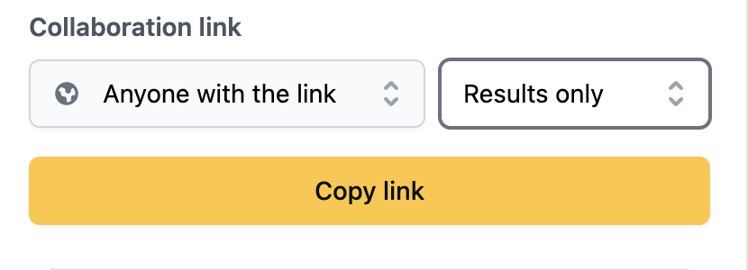
The shareable link flow
Much of the same reasoning applies to the shareable link feature (see image below). We have three elements: the main dropdown, the results only/edit access dropdown, and the copy link button. We can reduce this and improve the UX by having a switch component that disables the access level menu when toggled off, a url input field, and a copy button.
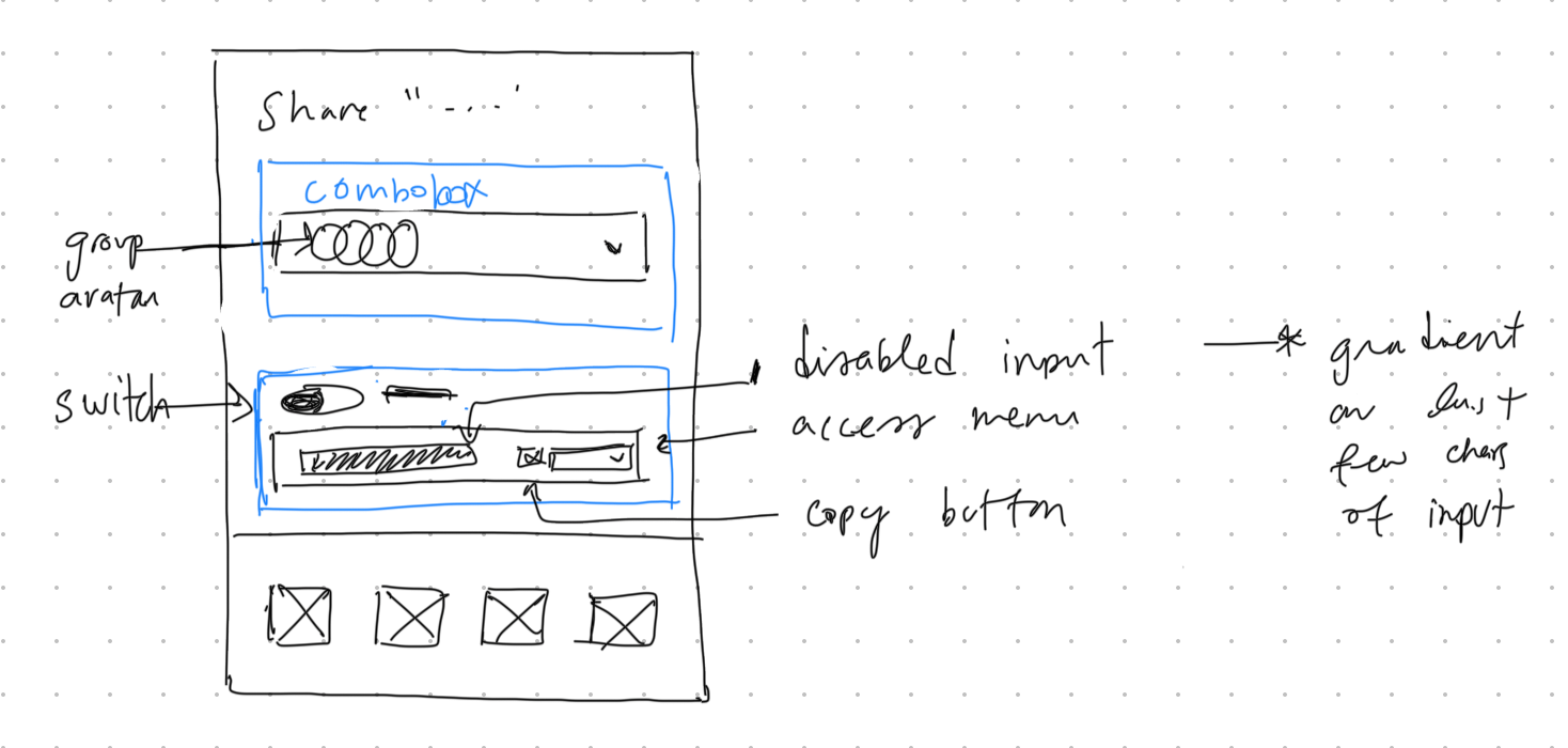
Sketching the solution
After validating my intuition through first principles, the design direction became clear. The solution removes the second screen and consolidates actions into a single combobox.
Sketching starts the engineering side of design, because you're physically drawing the feature's atoms, molecules, and organisms 4. This is great because the next step is thinking and planning the component architecture.
High fidelity mockup
I'm working solo, so I'm moving straight from sketch to code. If I were working with designers or in a more collaborative setting, the next step would typically be translating the sketch into a high-fidelity mockup in Figma. That extra layer helps align stakeholders and gives developers a precise reference before implementation begins.
From paper to architecture
We'll use Base UI as our primitives library. Base UI handles the accessibility and interaction patterns: semantics, focus management, keyboard interaction, layering/portals, ARIA wiring, measurement, and similar concerns. This lets us focus on the application logic and design rather than reimplementing popover behavior from scratch.
Since this is an optimization of an existing feature, a real implementation would require auditing the current codebase: understanding how state is managed, what APIs exist, and where the components live. Refactoring in place often means working around constraints that a greenfield build wouldn't have.
For the sake of this article, we'll treat this as a new component built from scratch. The patterns and decisions we explore still apply to refactoring work, but starting fresh lets us focus on the architecture itself without getting lost in migration details.
Let's make a tree to organize the components by hierarchy.
Share Popover
├── Trigger: Group avatar
└── Popup
├── Dynamic title
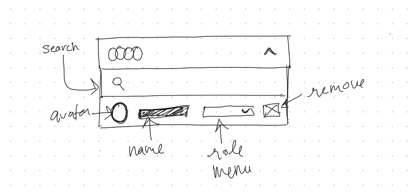
├── Combobox (collaborators):
│ ├── Trigger: Group avatar
│ └── Popup
│ ├── Search
│ └── List
│ └── Item
│ ├── Avatar
│ ├── Name
│ ├── Role select menu
│ └── Remove icon button
└── Shareable URL
├── Switch with label
├── URL
├── Access level menu when switch is toggled on
└── Copy buttonData modeling
We define Role as a union of string literals so the compiler catches typos and invalid assignments at build time.
type Role = "member" | "admin";A Collaborator pairs identity fields with a role. Nothing unusual here, just a straightforward object type.
type Collaborator = {
  id: string;
  name: string;
  email: string;
  avatarUrl: string;
  role: Role;
};
LinkAccess defines the permission levels for shareable links, separate from collaborator roles.
type LinkAccess = "view" | "edit";ShareableLinkState is a discriminated union. When enabled is false, the link has no URL or access level. When true, both become required. TypeScript uses enabled as the discriminant and narrows automatically in conditionals.
type ShareableLinkDisabled = {
  enabled: false;
};

type ShareableLinkEnabled = {
  enabled: true;
  url: string;
  accessLevel: LinkAccess;
};

type ShareableLinkState = ShareableLinkDisabled | ShareableLinkEnabled;
SearchState<T> applies the same pattern to async operations. You can't access results unless you've checked for "success", and you can't access error unless you've checked for "error". The generic lets us reuse this across different search result types.
type SearchState<T> =
  | { status: "idle" }
  | { status: "loading"; query: string }
  | { status: "success"; query: string; results: T[] }
  | { status: "error"; query: string; error: Error };
SharePopoverState composes these pieces. The popover tracks a form, its collaborators, an async search for adding new ones, and the shareable link configuration.
type SharePopoverState = {
  formId: string;
  collaborators: Collaborator[];
  search: SearchState<Collaborator>;
  shareableLink: ShareableLinkState;
};
If this data eventually moves into a shared store consumed by multiple features (settings panel, team management page, sidebar), normalization becomes important to prevent sync issues. For a single component, the simpler approach is fine.
Data fetching
The inline search combobox needs standard request patterns: debouncing, request cancellation, caching, and pagination. Libraries like TanStack Query or SWR handle these out of the box.
Data mutation
The popover needs to handle four mutations: adding a collaborator from search results, changing a collaborator's role, removing a collaborator, and toggling the shareable link. The first three are straightforward array operations. The shareable link toggle needs to be async because enabling it generates a URL server-side.
function handleAddCollaborator(user: Collaborator) {
  // ...
}

function handleRemoveCollaborator(id: string) {
  // ...
}

function handleRoleChange(id: string, role: Role) {
  // ...
}

async function handleShareableLinkToggle(enabled: boolean) {
  try {
    if (!enabled) {
      await api.deleteShareableLink(formId);
      setShareableLink({ enabled: false });
      return;
    }
    const url = await api.createShareableLink(formId);
    setShareableLink({ enabled: true, url, accessLevel: "view" });
  } catch (error) {
    console.error("Failed to toggle shareable link:", error);
  }
}
Toggling off deletes the link, so re-enabling generates a new URL. An alternative is to preserve the link and toggle access server-side, which keeps the URL stable but means a "revoked" link could be reactivated.
Performance optimization
Perceived performance
Optimistic updates make mutations feel instant. When a user adds a collaborator, update the UI immediately and roll back only if the server request fails.
Prefetch on hover reduces perceived latency. Users hover before they click, so we can use that time to start fetching data. When the user hovers over the share button, prefetch the collaborators list. By the time they click and the popover opens, the data is already there.
function prefetchCollaborators() {
  if (cache.has(formId)) return;

  fetch(`/api/forms/${formId}/collaborators`)
    .then((r) => r.json())
    .then((data) => cache.set(formId, data));
}

<button
  onMouseEnter={prefetchCollaborators}
  onClick={openPopover}
>
  Share
</button>
Accessibility
Focus management
A popover needs to manage focus through its full lifecycle: moving focus into the popover on open, trapping it so Tab and Shift+Tab cycle within the popover rather than escaping to the page, and returning focus to the trigger when it closes. Base UI handles all of this out of the box.
The combobox adds a layer of complexity. DOM focus stays in the search input at all times and list items aren't focused directly. Instead, arrow keys move a virtual highlight across items using the [data-highlighted] attribute. This is what visually indicates the active item while keeping the input editable.
From architecture to build
Implementation often reveals improvements the sketch missed. My original sketch placed the switch on the left side of the shareable URL row, but during the build I moved it to the right. It follows the natural reading direction and keeps the label prominent. I also moved the access level menu to its own row for clearer separation between the toggle and the permission setting.
The sketch gets you close, but seeing the actual component in context exposes these kinds of refinements.
The interactive demo below shows the final result: a single-screen flow that consolidates the original multi-step interaction and simplifies the URL sharing process.
Small details matter too: the section headings have a 2px left padding to visually align with the combobox input, the kind of subtle adjustment that's easy to overlook but improves the overall feel.
Open your browser's Network tab and hover over "Add people..." to see the prefetch request fire before clicking.
For the copy URL feedback, I used Base UI's anchored toast component, giving users immediate, contextual confirmation that the link was copied.
Final thoughts
This walkthrough offers one lens for approaching design engineering: starting from intuition, validating through first principles, sketching to externalize ideas, modeling data to match behavior, and finally building. None of this is prescriptive. Every project has its own constraints, and the best process is the one you refine through iteration. The goal isn't to follow a rigid framework, but to develop an instinct for what to design and what to engineer.
- Discount Usability: 20 Years — Nielsen Norman Group on lightweight usability methods that catch most issues.
- Jakob's Law of Internet User Experience — Jakob Nielsen on why users prefer interfaces that behave like familiar ones.
- Jakob's Law — A concise visual reference for the principle and its implications for UI design.
- Atomic Design — Brad Frost on structuring UI into atoms, molecules, organisms, templates, and pages.