Design engineering a collaborate popover
Simplifying a share popover, from intuition to sketch to working component
I've designed and built many UIs over the years, so intuition plays a big role in recognizing when an interface can be improved. When something feels off about an interaction, that feeling is experience compressed into a signal. The noticing comes first. Theory and vocabulary come after, to validate and communicate what you noticed.
Still, validated intuition makes for stronger design decisions, and validation doesn't require a formal study. Lightweight methods like heuristic evaluation and discount usability testing1 surface most issues.
Idea to paper
Take the example above, a share and collaborate popover. My intuition says it makes users work harder than they need to. Let's break it down.
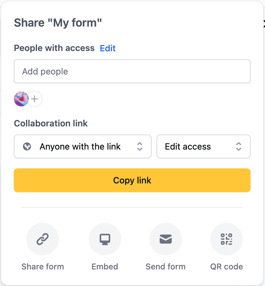
The add people flow
The "Add people" input looks like you should be able to click it, type, and search for users to add. Instead, clicking it navigates to a second screen. It resembles the standard input field found everywhere on the web, so it should behave like one. The false affordance goes against Jakob's Law23 and makes users stop and think about something that should be automatic.
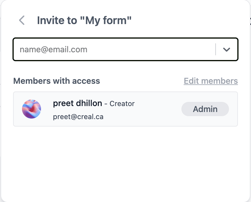
The second screen is an extra step between the user and their task. Its Edit members button leads to a settings page where the same actions already exist. Since that page covers member management, a single combobox can absorb both the primary flow and the second screen.
The shareable link flow
The shareable link feature has the same problem. Three elements do the work: the main dropdown, the results only and edit access dropdown, and the copy link button. A switch, a url field, and a copy button cover the same ground, with the switch disabling the access level menu when toggled off.
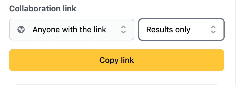
Sketching the solution
With the intuition validated, the direction was clear: remove the second screen and consolidate the actions into a single combobox.
Sketching starts the engineering side of design. You're physically drawing the feature's atoms, molecules, and organisms4, and those map almost one to one onto the component architecture you'll plan next.
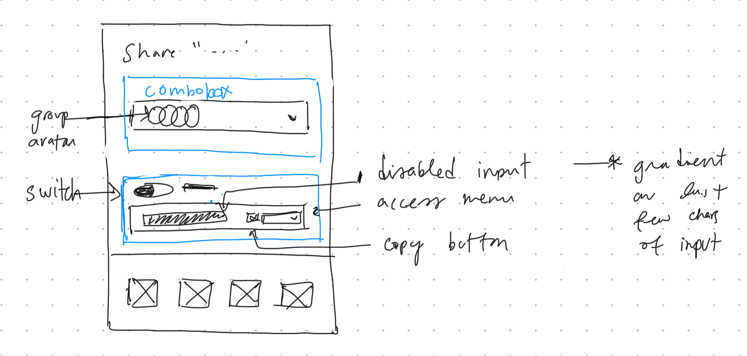
What happens next depends on the organization. Some teams translate the sketch into a high fidelity Figma mockup first, to align stakeholders and give developers a precise reference. Others go straight from sketch to code and iterate there. For this demo I'm taking the direct route.
I'm also treating the popover as a standalone component. In a real codebase it would live inside a design system, where the combobox, the select, the switch and the toast all come from shared primitives that already carry their own tokens, states and constraints. That's a topic worth its own post, so I'm leaving it out here.
Paper to architecture
We'll use Base UI as our primitives library. It handles the accessibility and interaction patterns: semantics, focus management, keyboard interaction, layering and portals, and ARIA wiring. That leaves the application logic and the design to us.
Share Popover
├── Trigger: group avatar
└── Popup
    ├── Collaborators: combobox
    │   ├── Search: text input
    │   └── Item: avatar, name, role select
    └── Shareable link: section
        ├── Toggle: switch with label
        ├── URL: read-only input
        │   └── Copy: button with toast confirmation
        └── Access level: select, visible while the toggle is on
Component hierarchy tree
Data modeling
A shareable link either exists or it doesn't, so a discriminated union fits: when enabled is false there's no url or access level to read, and when it's true both are required. TypeScript narrows on enabled automatically, so no consumer null checks a url that logically can't be there.
The same pattern applies to async operations. You can't access results unless you've checked for "success", and you can't access error unless you've checked for "error". The generic lets us reuse this across different search result types.
type ShareableLinkState =
  | { enabled: false }
  | { enabled: true; url: string; accessLevel: "view" | "edit" };

type SearchState<T> =
  | { status: "idle" }
  | { status: "loading"; query: string }
  | { status: "success"; query: string; results: T[] }
  | { status: "error"; query: string; error: Error };
The inline search combobox also needs the standard request patterns: debouncing, request cancellation, caching, and pagination. Libraries like TanStack Query or SWR handle these out of the box, but we'll skip over them for this demo.
Data mutation
Most of the popover's mutations can be applied optimistically, since the client already knows the resulting state. The shareable link toggle is the exception: enabling it returns a server generated URL, so the UI has to wait for it (the demo fakes this with a hardcoded URL).
async function handleShareableLinkToggle(enabled: boolean) {
  if (!enabled) {
    await api.deleteShareableLink(formId);
    return setShareableLink({ enabled: false });
  }
  const url = await api.createShareableLink(formId);
  setShareableLink({ enabled: true, url, accessLevel: "view" });
}Performance
Optimistic updates make mutations feel instant. When a user adds a collaborator, we update the UI immediately and roll back only if the server request fails.
In a connected application, prefetching on hover can reduce perceived latency by loading the data the popover will use before it opens. This demo keeps its example users locally, so opening it requires no network request.
Accessibility
A popover needs to move focus in on open, trap it so Tab and Shift+Tab cycle within the popover rather than escaping to the page, and return focus to the trigger when it closes. Base UI handles all of this out of the box. The combobox is trickier. DOM focus stays in the search input at all times, and list items are never focused directly. Arrow keys move a virtual highlight across items using the [data-highlighted] attribute, which is what visually indicates the active item while keeping the input editable.
Architecture to build
Building the component revealed refinements the sketch missed. Trying an idea in code takes minutes, so the rest of this section covers the changes that came out of the build.
Most of them were small. The copy button cross-fades between the copy and check icons with a hint of blur, the share actions scale down slightly on press, and the avatar group's overflow counter uses tabular numbers so it doesn't jitter. The section headings also carry 2px of left padding to optically align with the combobox input. Nobody will consciously notice it, which is the point.
None of these were planned. They came out of building, trying things, and keeping what felt right.
The demo below shows the final result, a single screen flow that replaces the original multi step interaction. Try typing an email that isn't in the list to see the invite flow.
For the copy URL feedback I used Base UI's anchored toast component, so the confirmation appears right next to the button instead of in a far corner of the screen.
This was a high level walkthrough, so it isn't perfect. There are edge cases I didn't handle and calls I'd revisit. But it's a strong starting point, and what stays with me is how quickly it came together.
Every project has its own constraints, and the process bends to fit them. What carries over is the instinct for which problems need design and which need engineering.
Footnotes
-
Discount Usability: 20 Years. Nielsen Norman Group on lightweight usability methods that catch most issues. ↩
-
Jakob's Law of Internet User Experience. Jakob Nielsen on why users prefer interfaces that behave like familiar ones. ↩
-
Jakob's Law. A concise visual reference for the principle and its implications for UI design. ↩
-
Atomic Design. Brad Frost on structuring UI into atoms, molecules, organisms, templates, and pages. ↩